By Debra Simon
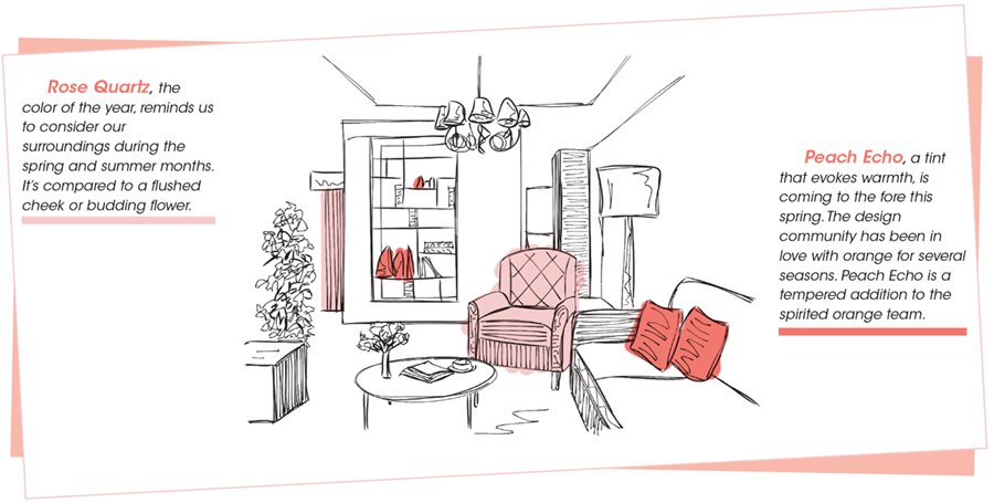
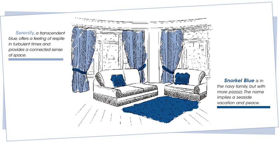
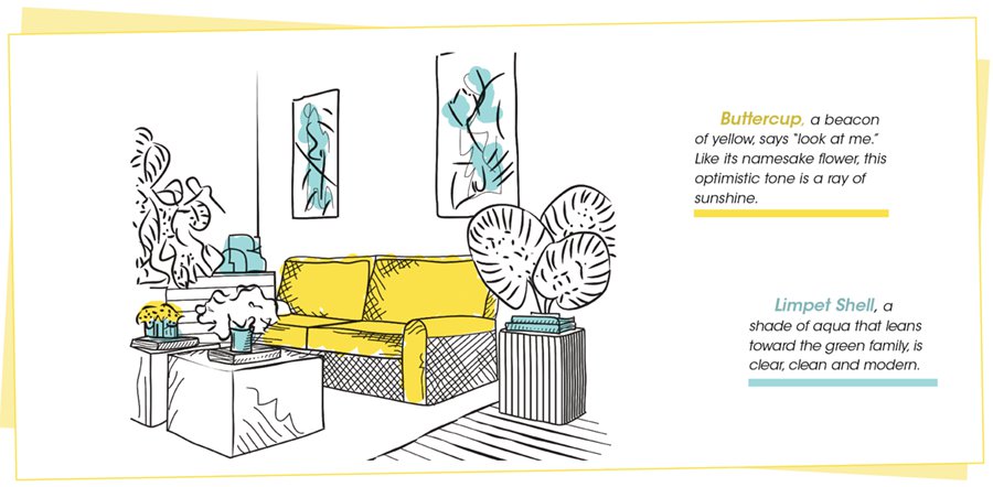
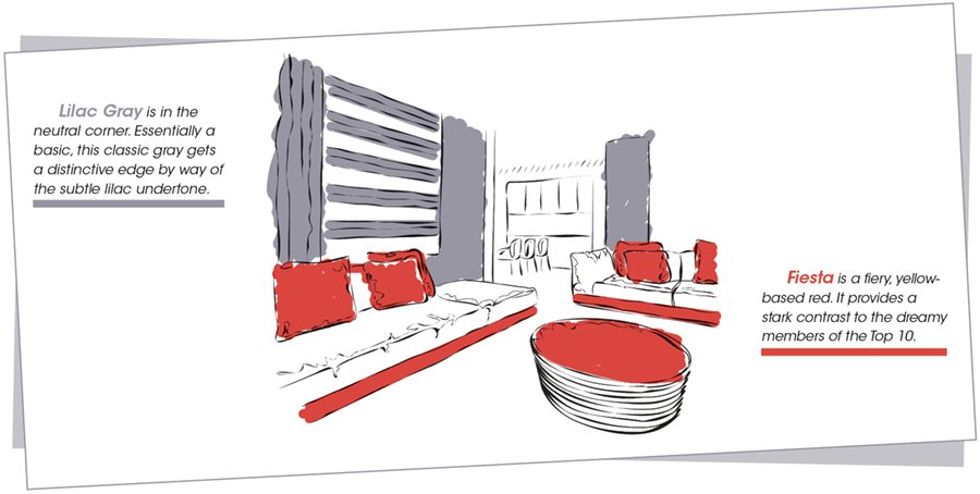
Ever seen the hue Rose Quartz? Well, get ready, you'll be eyeing a lot of it in Triangle shops this year. Pantone, the global authority on color trends, anointed it the No. 1 color of 2016. Rose Quartz and the other top shades are destined to be prominent in both interior design and fashion.
Leatrice Eiseman, executive director of the Pantone Color Institute, says, "Colors this season transport us to a happier place."
She continues by suggesting that these soft shades provide a sense of calm during a time of political and economic uncertainty.
Here's the essence of the Pantone report:
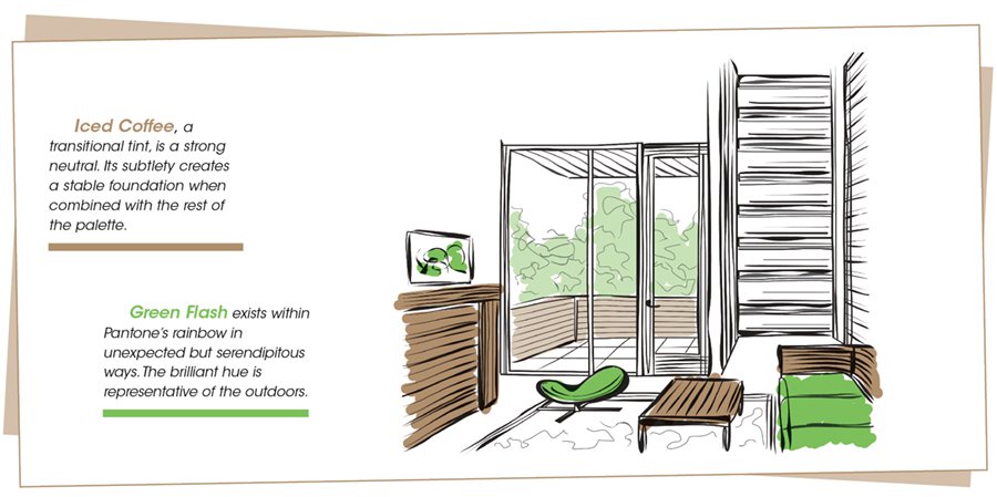
The palette of 2016 reflects art, global politics and a desire to disconnect from technology. Paying homage to nature's beauty, the choices transport people to more tranquil, mindful environs that encourage relaxation as well as curiosity and exploration.
Pantone's prognosticators were also inspired by the contrast of urban design and lush vegetation, leading to unexpected blends. By creating looks that represent our world, both constructed and organic, the hues awaken a sense of reflection and playful escapism.
Artists such as Matisse and Picasso, known for using daring paints as well as bold shapes and lines, were inspirations. So, also, were Cuba and other destinations south of the border.